theBikBank (UI)
The context
This project was about creating a new interface for a fiction bank, where the tone and personality were predefined as clear, playful and trustworthy. This was the use case I had to work on during my studies for the UI certificate, at the UX Design Institute.
The new interface would have to work across desktop, mobile and tablet devices and the focus were on three screens in particular:
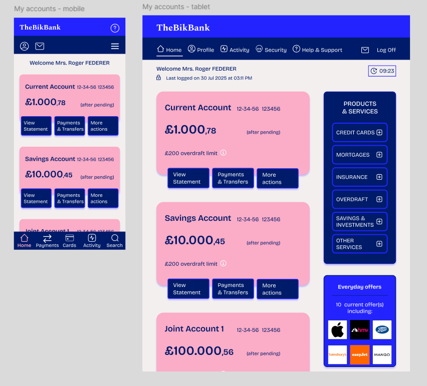
- ‘Accounts overview’ screen: The banking home screen with an overview of user’s accounts
- ‘Current account’ screen: The screen with day to day spendings, including recent transactions, quick links to regular payees, etc.
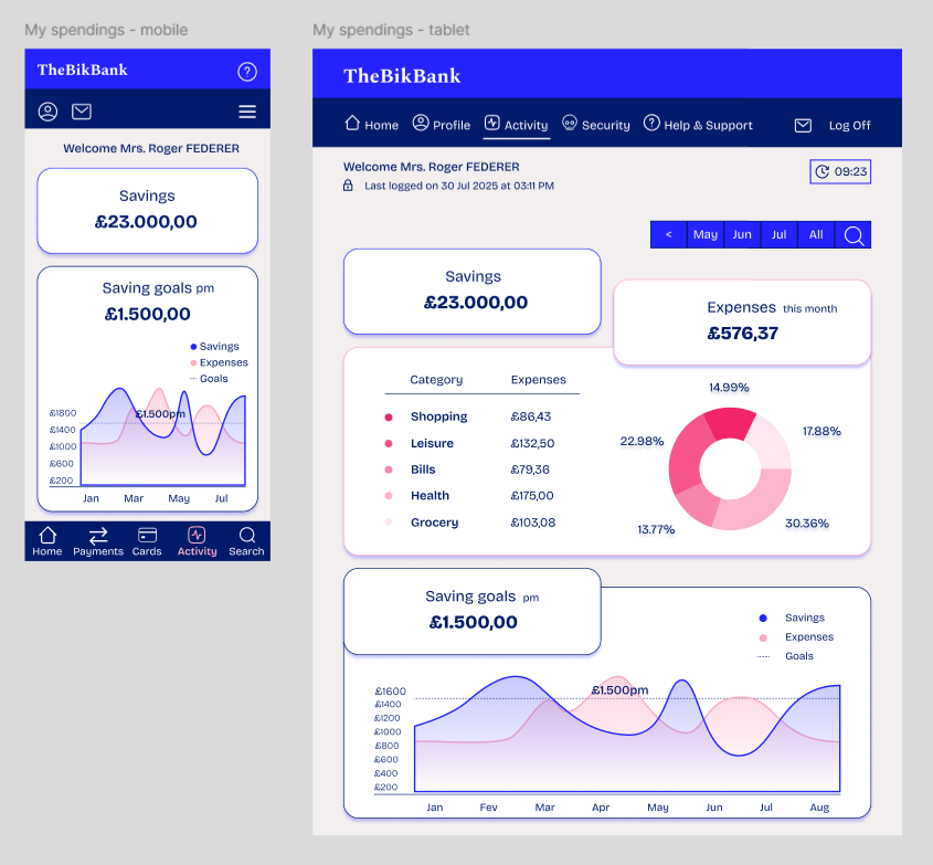
- ‘My spending’ screen: The screen about savings goals, spending over time, etc., with some data visualisation
The goal was to use all our UI knowledge to bult a high quality, visually appealing interface that would stand out from competitors and users would like to use it.
The process
First step was some analysis on what clear, playful and trustworthy means in terms of content, layout, typography, spacing, colour etc., and how all these three could harmoniously co-exist.
Some ideas started to emerge by collecting some references in a mood board.
The process of creating the screens was fun and enjoyable, the attention for detail striking (but familiar!).