Maga Fuga (UX)
The context
This project was the assignment I had to work on during my studies for the professional UX diploma, at the UX Design Institute.
The scope of the assignment was to create a new website for a fictional airline company following all steps of the UX process.
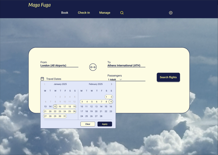
The focus was on the booking process, from searching for a location, dates and number of passengers to choosing a flight fare and proceeding to the booking summary.
The goal was the new website to have improvements that address challenges on websites and mobile apps of existing companies of the industry and by doing so, to improve the flight booking experience.
The problem
After gathering as much information as possible via an online survey, usability tests and completive benchmarking, it became apparent that the main pain points the users face when booking a flight are mainly unclear information about pricing and baggage policy and unclear functionality of booking extras, sometimes even being preselected adding friction to the users for having to monitor closely and deselect them during the booking process.

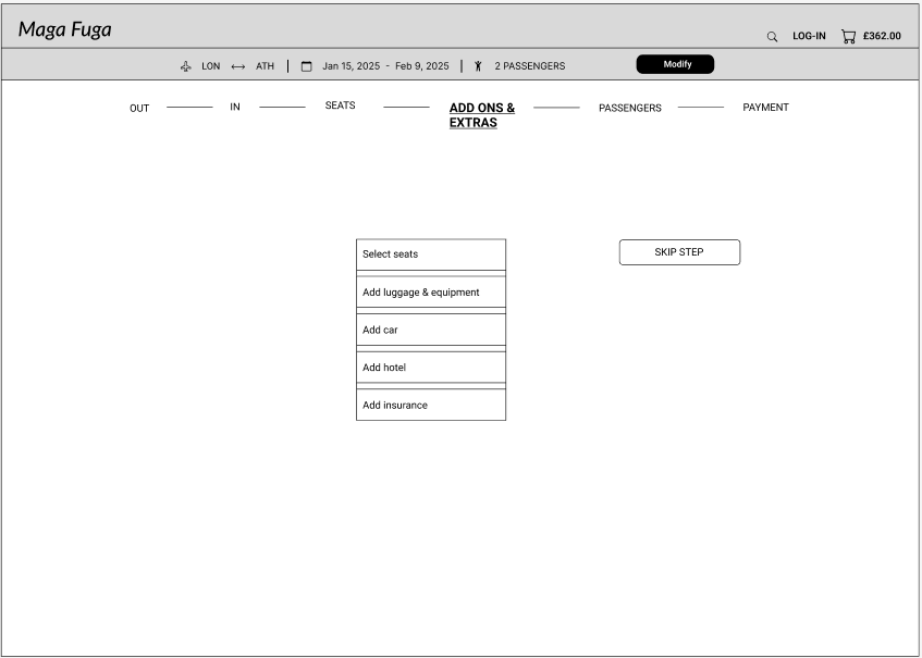
So here I had the issues I wanted to address; my focus should be to improve the experience of the ‘Select fare’, ‘Select luggage’ and ‘Select extras’ steps of the customer journey, that seemed the lowest point of user experience during the booking process.
The process
So the design step started! When all the interactions and the screens states have been finalised, with the help of a flow diagram and many messy sketches, I decided to first start with a medium fidelity prototype, so I can test the screen layout, including things like the visual hierarchy and affordances, the navigation, the interaction, the terminology, etc.
I decided to call my fiction company ‘Maga Fuga’, from the Latin ‘Maga’ (witch) and ‘fuga’ (flight), making it a very loose translation of ‘Magic flight’!
To address the pain points:
- In the fare selection, I made the information clear and all available with one click only. The ‘i’ icon is available for further details at the same window. Anything that needs to be filtered, e.g. filter of fares or date, is pre-filtered with the most ‘conservative’ value. There is no ‘catch’.
- Luggage and extras are all under one step ‘Add-ons and extras’, that also include the seats selection. If any selected, it becomes a clickable step in the progress bar, so the user can go back to each of them easily at any give time to make a change. Adding the booked extras to the progress bar, it gives an additional clue to the users of what they have already booked without the extra click of visiting the basket.

The results
The final version of the medium fidelity prototype took part in another round of usability tests for validation! The feedback was positive that the functionality is more intuitive and the experience of booking a flight smoother.
The evolution
After taking my certificate in UI, I decided as a second phase of my project, to create a high fidelity prototype for my website. The purpose of this project was to make my website look more real and beautiful by experimenting with the UI concepts I have just learned.